
FUCK THE POLICE
911 EVERY DAY
I've been reading a lot of Islamophobic propaganda lately, and I stumbled on this gem:
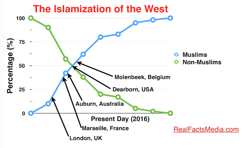
Can anyone actually understand anything about this graph? It like doesn't even have an X-axis (unless the words "Present Day (2016)" count as an X-axis). This appears to have been made in all seriousness somehow, it is not in fact a parody.
Can anyone actually understand anything about this graph? It like doesn't even have an X-axis (unless the words "Present Day (2016)" count as an X-axis). This appears to have been made in all seriousness somehow, it is not in fact a parody.
 You're holding it sideways! (what an idiot)