Ultimate online climate tool. No, I'm not talking about myself.

tinfoil

Banned
I just found this great little page.

http://www.ncdc.noaa.gov/oa/climate/research/cag3/na.html

to make sweet graphs of climate data and it makes an image for you to link to.

here's the lastes 10 year trend.
graph-Jan1704:10:384350585937.gif
 
Gee, now why would you have left out 1997? Why oh why?

Let me see... because when you include 1997 you end up with a graph like this?

graph-Jan1705:52:426394042968.gif


Bummer.

You know what? If you can leave out inconvenient dates, so can I. Here's my graph leaving out 2008, using the ten years between 1997 and 2007.

graph-Jan1705:55:056944274902.gif


Perhaps you are beginning to see how retarded it is to selectively choose a narrow period of time from which to sample your trend when you have a data set that is ten times as large.
 
Last edited:
Ouch.

I'm shocked, really - tinfoil never seemed to have the sort of agenda that would cause him to cherrypick data.
 
graph-Jan1711:18:139786987304.gif


That 100 year trend just isn't that scary. If it continues, we might warm 2 degrees in 100 years. Or abut the same rate of warming since the last glacial period.
 
I'm more worried about a potential mini ice age. With you morons falling right into the trap of the elite, who are now controlling science the way their families used religion and controlled the masses centuries ago, The cost of heating in an ice age with be more than it needs to be and folks like Al Gore, with pockets full of carbon trading dollars, will be laughing all the way to the bank as we mere peasants struggle to find the money for all carbon taxes , both levied and built into products and services. The poor will lose ever more ground and live a miserably chilly homelife when they're forced to choose between carbon taxes and baby food.

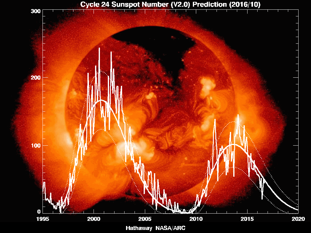
sunspot_num_graph_big.jpg


they keep predicting cycle 24 to begin and then it keeps getting revised. It's scary people. Mayans 2012. procession. Hello!!
this is the shift. The mayans knew about milankovitch cycles and ice ages!
ssn_predict_l.gif
 
Last edited:
graph-Jan1705:55:056944274902.gif


minority_grads.gif


OMG! The trend is similar! Global warming must be related to the number of Wisconsin Technical College minority graduates!
 
Gee, now why would you have left out 1997? Why oh why?

Let me see... because when you include 1997 you end up with a graph like this?

graph-Jan1705:52:426394042968.gif


Bummer.

You know what? If you can leave out inconvenient dates, so can I. Here's my graph leaving out 2008, using the ten years between 1997 and 2007.

graph-Jan1705:55:056944274902.gif


Perhaps you are beginning to see how retarded it is to selectively choose a narrow period of time from which to sample your trend when you have a data set that is ten times as large.

There is a difference, he used the past ten years. You cherry picked a ten year period. When analyzing data, typically you look at periods that end with the closest current quarter. Which in this case would be year end 2008. Common time frames used in statistical analysis are 1, 3, 5, 10, 20, 50, 100 years. What you do not tend to see is someone eliminate the past years data just so his ten year time frame can show what he wants it to.
 
There is a difference, he used the past ten years. You cherry picked a ten year period. When analyzing data, typically you look at periods that end with the closest current quarter. Which in this case would be year end 2008. Common time frames used in statistical analysis are 1, 3, 5, 10, 20, 50, 100 years. What you do not tend to see is someone eliminate the past years data just so his ten year time frame can show what he wants it to.

There's no difference. He didn't pick the "last ten years" last year because "THE LAST TEN YEARS" is a meaningless timeframe when establishing warming/cooling trends, particularly when the trend bucks the larger trend and shows something askew. Statistically speaking, that's an anomaly since a single year of that ten year period, as I've shown, is capable of fucking up the trend and flatlining it entirely. So basically his "trend" relies entirely on the fact that 08 was a colder year than usual (in the us).
 
There's no difference. He didn't pick the "last ten years" last year because "THE LAST TEN YEARS" is a meaningless timeframe when establishing warming/cooling trends, particularly when the trend bucks the larger trend and shows something askew. Statistically speaking, that's an anomaly since a single year of that ten year period, as I've shown, is capable of fucking up the trend and flatlining it entirely. So basically his "trend" relies entirely on the fact that 08 was a colder year than usual (in the us).

Bullshit... that is simply YOUR excuse for not wanting to see it. You want to see the LONG term trend? Then look to the whole century. If 1934 was the warmest year on record, then the trend since then is worst case FLAT. Not up.

The past ten years is NOT a meaningless timeframe as it shows that for the past decade it again is essentially flat. You on the other hand DID pick a meaningless timeframe as you randomly picked a ten year timeframe rather than any set standard.

There are plenty of valid reasons to combat pollution, reduce dependency on foreign energy, invest in alt energy, etc.... but those like you who desperately cling to the belief that MAN MUST be the reason for 'warming', continue to ignore any data that suggests otherwise.

1998, 2005, 1934 are the anomolies. Not the long term trend.
 
This should really be very simple. Last year the 10 year trend showed a big upswing. This year it shows a swing in the opposite direction to the same degree. That means a single year threw the trend without being an anomalous year itself with respect to the degree of temperatures we experienced in the US (it wasn't particularly cold compared to many years, not even the coldest of the last 10). If a single year can skew the result that much without being a totally bizarro year temperature wise, then the time period is too short to be meaningful.

Had I posted the trend last year, you'd have said the same thing.

As for sun spots, I contend that it's the Wisconsin Technical College graduating class that determines it instead. My graph proves it.
 
Last edited:
This should really be very simple. Last year the 10 year trend showed a big upswing. This year it shows a swing in the opposite direction to the same degree. That means a single year threw the trend without being an anomalous year itself with respect to the degree of temperatures we experienced in the US (it wasn't particularly cold compared to many years, not even the coldest of the last 10). If a single year can skew the result that much without being a totally bizarro year temperature wise, then the time period is too short to be meaningful.

Had I posted the trend last year, you'd have said the same thing.

As for sun spots, I contend that it's the Wisconsin Technical College graduating class that determines it instead. My graph proves it.

except it didn't throw the trend. One is flat, the other is slightly down. Both of which fit into the overall long term trend of little change.
 
http://www.skepticalscience.com/global-cooling-january-2007-to-january-2008.htm

It aint the sun. No rising trend since the 70s in solar activity.

http://www.pmodwrc.ch/pmod.php?topic=tsi/composite/SolarConstant

By the way, if you're looking to have every one of your other silly arguments ripped to shreds, you can avoid the embarrassment of this thread and skip straight to here and no one will ever know.

http://www.skepticalscience.com/argument.php

I posted credible graphs. 1970 show a little over an average of 100 sunspots. 1980, 1990 are both well over 150 average and so is 2000.

Don't know what you're link says, but look at the damn data.
 
I posted credible graphs. 1970 show a little over an average of 100 sunspots. 1980, 1990 are both well over 150 average and so is 2000.

Don't know what you're link says, but look at the damn data.

Here's your data:
comp06_d41_61_0812.png


Declining solar output. BUMMER!
 
Here's your data:
comp06_d41_61_0812.png


Declining solar output. BUMMER!

You don't even understand the argument.
You posted solar irradiance. LOL

Sunspots, McFly, Sunspots!!
They disrupt cosmic rays and when they're not disrupting cosmic rays like when solar output is low and sunspots are near zero,...HINT: right now!!... more clouds form and the net effect is cooling.
low-cloud-cover.gif


Do try to understand the argument, mr. warmer
 
Last edited:
Back
Top