We've never been through a period of global warming anywhere near this fast. There are two issues the low-IQ set has, which cause them to cite graphs like the one you did:
(1) They can't tell the difference between local warming and global warming, so they'll point to a single site to try to make a point about the globe as a whole.
(2) They have no grasp of timescale, so they'll point to a graph that's so compressed that it's impossible to gauge the speed of warming on a scale relevant to the current period of anthropogenic warming.
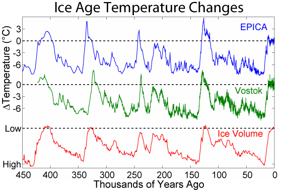
As to that latter point, take a look at the graph. In pixel terms, it's about 676 pixels wide, and covers a period of about 425,000 years. So, every single horizontal pixel marks about 629 years. Thus, the entire period of the current instrument record (1880-2019) would take up about 1/5 of one pixel. The industrial era would not even show up on that graph -- disappearing between pixels.
So, take a look at one of those temperature spikes.... say, the most recent one. It runs from abut -8 degrees Celsius to about 2 degrees Celsius over the course of about 13 horizontal pixels. That's about 8,180 years.... a period longer than the whole history of human civilization. So, even in that very rapid period of local warming, we're talking about a warming rate of about 818 years per degree of warming. By comparison, since 1975, warming has been happening at a rate of about 1.5-2 degrees C per century. We're talking about warming currently happening at a pace over a thousand times what you see in the steep parts of your graph.
Of course, that's all obvious at a moment's glance to anyone with a science background, or at least a decent IQ. But it never even occurs to the dummies on the right, who will post graphs like that, imagining foolishly that they support their case. How can one even discuss such matters with people that thick?


 Doesn't think he is a gullible, brain dead moron.
")